
Lead with the promise
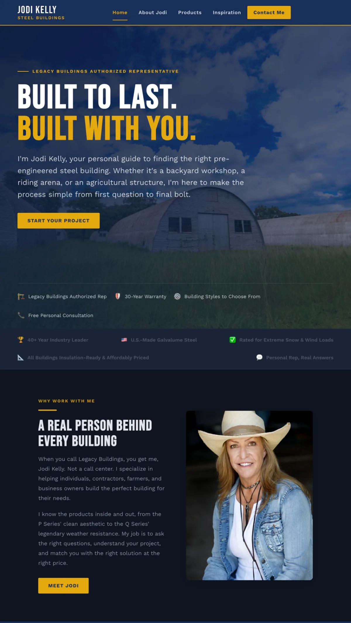
“Built to last. Built with you.” gives the homepage a clear starting point. The supporting introduction explains the offer in plain language and positions Jodi as a guide, not simply a name next to a product catalog.
Case study / Jodi Kelly Buildings
A static HTML website that puts Jodi's expertise first, makes steel building options easier to understand, and gives visitors a clear next step.
The challenge
A person looking for a workshop, an agricultural building, or a larger steel structure may not know which building style to choose. A useful website has to meet that person before they know all the terminology.
For Jodi Kelly Buildings, the website also needed to communicate something more personal: there is a real person helping customers work through those choices. The site could not be only a collection of building pictures and specifications.
My work brought those two ideas together through an HTML website, clearer service messaging, and a more deliberate path through the content. Visitors can understand the offer, learn about Jodi, explore the options, and decide whether to start a conversation.
Scope: static HTML website development, content structure, service messaging, and search-friendly page organization. This was not a WordPress build or a CMS migration.
The approach
The design and content work together to answer a visitor's next question, rather than ask them to figure out the business on their own.
“Built to last. Built with you.” gives the homepage a clear starting point. The supporting introduction explains the offer in plain language and positions Jodi as a guide, not simply a name next to a product catalog.
The content connects steel buildings to the projects people have in mind: workshops, agricultural structures, and other practical uses. That gives visitors a way into the subject before they need to understand every building style.
Jodi's photo and introduction bring the person behind the business into the page. The “Why work with me” section explains the value of personal guidance alongside the building information.
The navigation separates the introduction, products, inspiration, and contact. “Start your project” and “Contact me” give visitors a direct path when they are ready, without making every section a sales pitch.
The build
I built this site in HTML. That distinction matters because the work was about shaping the website around the content and customer journey, not configuring a publishing platform.
A static site gives me direct control over the page structure and presentation. For this project, the focus was a clear business introduction, useful content sections, and an obvious way to make contact.
There is a tradeoff. An HTML site does not automatically give a business owner the editing interface of a CMS. Content updates need an agreed workflow. I would not recommend the same setup by default for a large editorial team or a business publishing new material every day.
The useful platform question is not “Which CMS should every business use?” It is “What does this website need to do, and how will it be maintained?” Sometimes the answer is a CMS. In this case, the delivered website was a static HTML build.
Search and clarity
For a specialized business, search-friendly content begins with explaining the offer well. Who helps the customer? What kinds of projects are relevant? What can someone do if they are not sure which option is right?
The content structure gives those questions a place. Headings, product information, and a personal introduction help visitors move from a broad need toward a more informed inquiry.
That is also how I think about SEO and AI search readiness: build useful source material first. A clearly explained business is a better starting point than a page filled with keywords that never helps someone make a decision.
This case study does not claim a particular ranking, AI citation, or conversion lift. Those are outcomes to measure separately, not benefits to assume because the site has launched.
The result
The delivered site brings the building offer, Jodi's role, and the inquiry path into one coherent experience. Its purpose is easy to explain: help someone understand the possibilities and feel ready to ask the next question.
The next measurement questions are equally practical. Which non-branded searches bring people to the site? Which pages help them explore the options? Are contact actions becoming qualified conversations? Those are the signals I would use to guide future changes, rather than treating launch as the finish line.
For another small business, the lesson is not to copy the technology or the design. It is to make the offer understandable, give the visitor enough context to act, and choose a site structure the business can maintain.
If your website needs that kind of clarity, explore content strategy, SEO consulting, or a website audit to identify the right starting point.