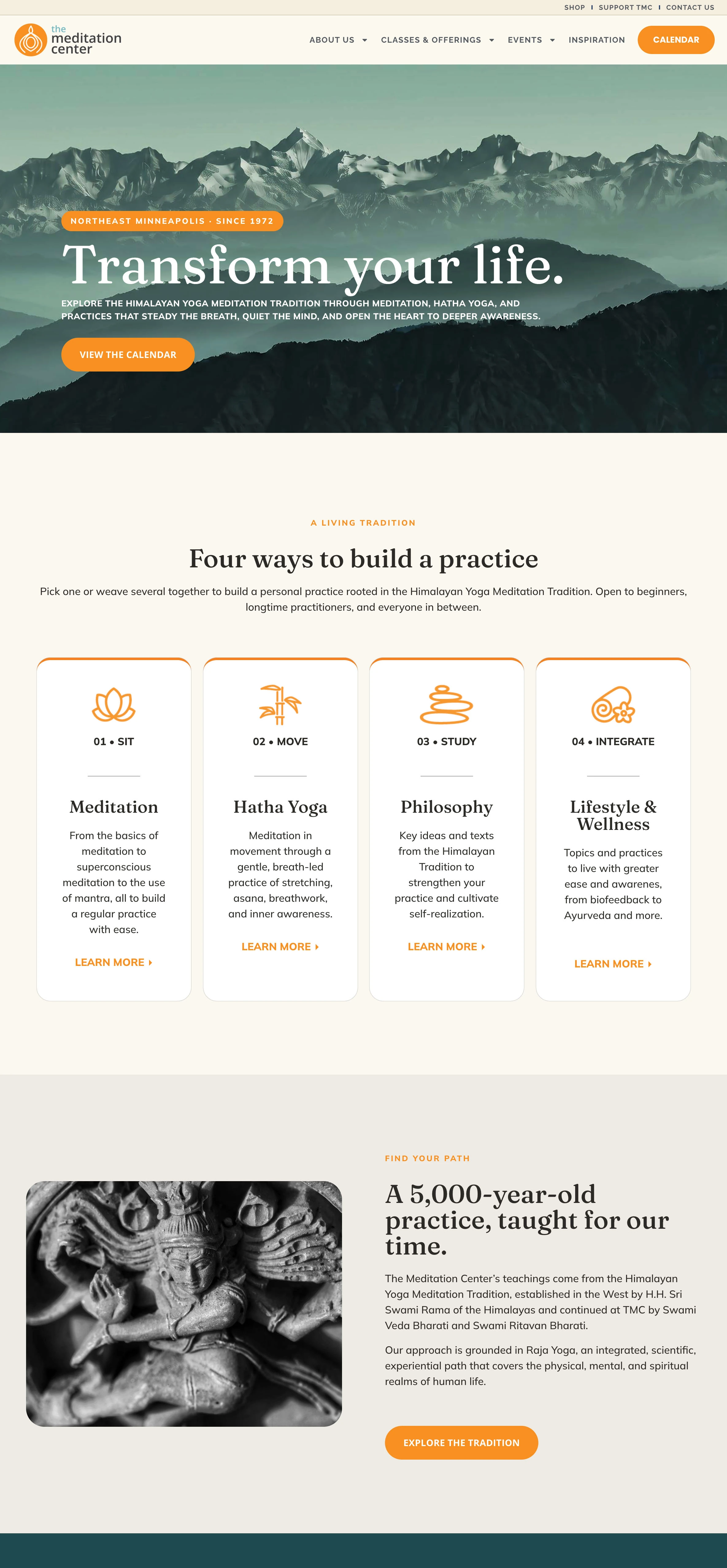
The redesign brought together a clearer content structure, a new visual direction, locally focused SEO/GEO content, original photography, and Mindbody integration. Each part supported the same goal: help people understand the center and find their way into its offerings.
That is the result this case study can speak to. It does not attach an unverified increase in registrations, rankings, or AI citations to the launch.
Moving forward, the useful questions are whether relevant local searches bring people to the site, which offerings they explore, and whether the path to the calendar and registration works as intended. Those are measurement priorities, not results being claimed here.
For organizations with a rich history or a broad set of programs, a redesign is an opportunity to make the experience more understandable without making the organization less distinctive.
If your site needs that balance, explore website audits or SEO consulting to find the right starting point.
Design, UX, content, and photography by Andrew Charon, Double Atari.